Glyph-Based CSS Units
I'm big on fluid responsive CSS but I'm also kinda lazy and want 1 value to do 100 things. I find the visual parity of relative units in typography when we scale them can be a little unpredictable. It's a small pedantic thing but I'm lazy AND pedantic so sue me I've been using calc(1em + 0.45rem) which is pretty neat, but felt a little like over-engineering for the sake of being fancy.
em-based units (unitless #, %) objectively make the most sense because inheritance and they give us nice rhythm out of the box, but a literal em-based value (not in a function) varies a lot across families.
I was messing around with this earlier and decided to try a few literal values that use glyph-based calcs, and was pleasantly surprised by the results the 'cap' unit was giving me.
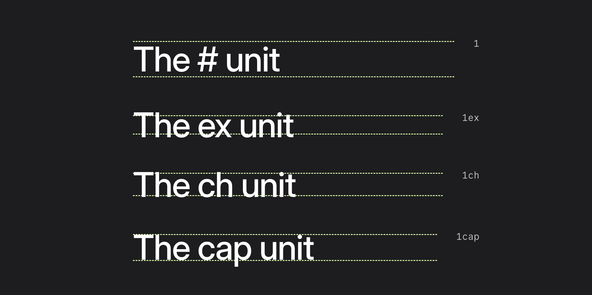
Line-height is the web version of print's 'leading height', but I discovered they actually behave differently. When we use em-based values the browser doesn't calculate values from the size of the glyphs, it uses the line-box, which is a little invisible block around the text we can't see, creating a kind of padding (called internal leading).
Type designers bake it in to prevent accents and descenders from colliding, which ensures legibility of that particular font but doesn't bode well where we want values to work across multiple families. So em is box-model. But units like ch, ex and cap are 'glyph-model'.
ch | The width of the '0' (zero) glyph. doesn't work for line-height obvious reasons (horizontal unit) but it's my favorite for constraining paragraph and heading widths. |
ex | The height of a lowercase 'x', isn't that reliable because x height varies pretty significantly across fonts. |
cap | The distance from the baseline to the top of flat capital letters (like H or I). |
cap gives us a stable vertical anchor, one we can see and (at least to me) is a good gauge of how it's going to scale across screen and font sizes. It's not the most objectively pretty one (1cap on a paragraph looks totally botched) but when you find the right value it seems to have much better visual parity.
It also works very nicely for icons, and seems like it could be a quasi workaround for text-box-edge and trim (until they become baseline) in some use cases.